Case Study

Website Redesign to improve UX and boost conversions

Project Overview

Role

Digital Designer

Timeline

2018 – 2025

Responsibilities

CRO Focused Design

Collaborators

Marketing and Engineering

The Growth Engineering website serves as the first impression for clients and prospects exploring its LMS and engagement solutions. It needed to balance clarity, persuasion, and scalability, all while supporting the company’s growing content ecosystem.

Yet the existing site was struggling. Navigation felt confusing, visuals were dated, and users were dropping off before reaching demo sign-ups. Conversion paths were inconsistent, and performance data showed friction at nearly every step.

This wasn’t a project with a formal timeline, it was a ongoing project throughought my time there recognising pain points and thinking, “I can make this work better.” So I rolled up my sleeves and done that.

Outcome:

A complete redesign that enhanced usability, improved navigation, and optimised demo conversion flows. Organic traffic increased, demo sign-ups rose, and the component-based design system enabled faster, more consistent future updates.

My Role & Team

As the designer and developer for this project, I was responsible for the end-to-end redesign and long-term maintenance/improvements of the website. I collaborated with:

  • Marketing to align the website with strategic business goals.
  • Developers to enhance backend performance and integrations.
  • Stakeholders to ensure the final product met company expectations.

I designed and built the new site using WordPress and Elementor Pro, while leveraging Adobe Creative Cloud for graphics and UI mockups. Over the years, I’ve continuously refined the site based on user behaviour, analytics insights, and industry best practices.

Additionally, the website had to work seamlessly with key third-party tools like HubSpot, GA, SEMrush, and LinkedIn tracking.

Outdated design: inconsistent branding, lack of visual appeal.

Poor usability: confusing navigation made it hard for users to understand products.

Slow performance: unoptimised page structures led to long load times.

Low engagement: blog layout and content presentation weren’t inviting.

The Problem

Difficulty finding content was creating friction and lost opportunities.

The website had strong foundations: clear messaging, a professional brand, and product content. But navigation was confusing, conversion paths were inconsistent, and key pages were buried. Visitors struggled to locate demos, product features, or case studies. Even internal stakeholders found it frustrating to update and manage content efficiently. The message was clear: people wanted to engage with the site, they just needed it to work with them, not against them.

We had a clear opportunity: simplify navigation, optimise conversion paths, and make the website intuitive, fast, and persuasive.

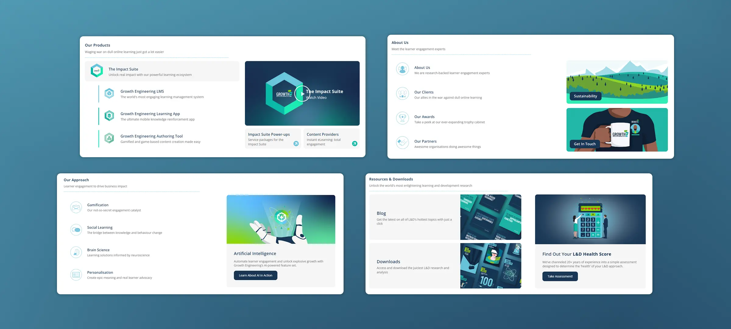
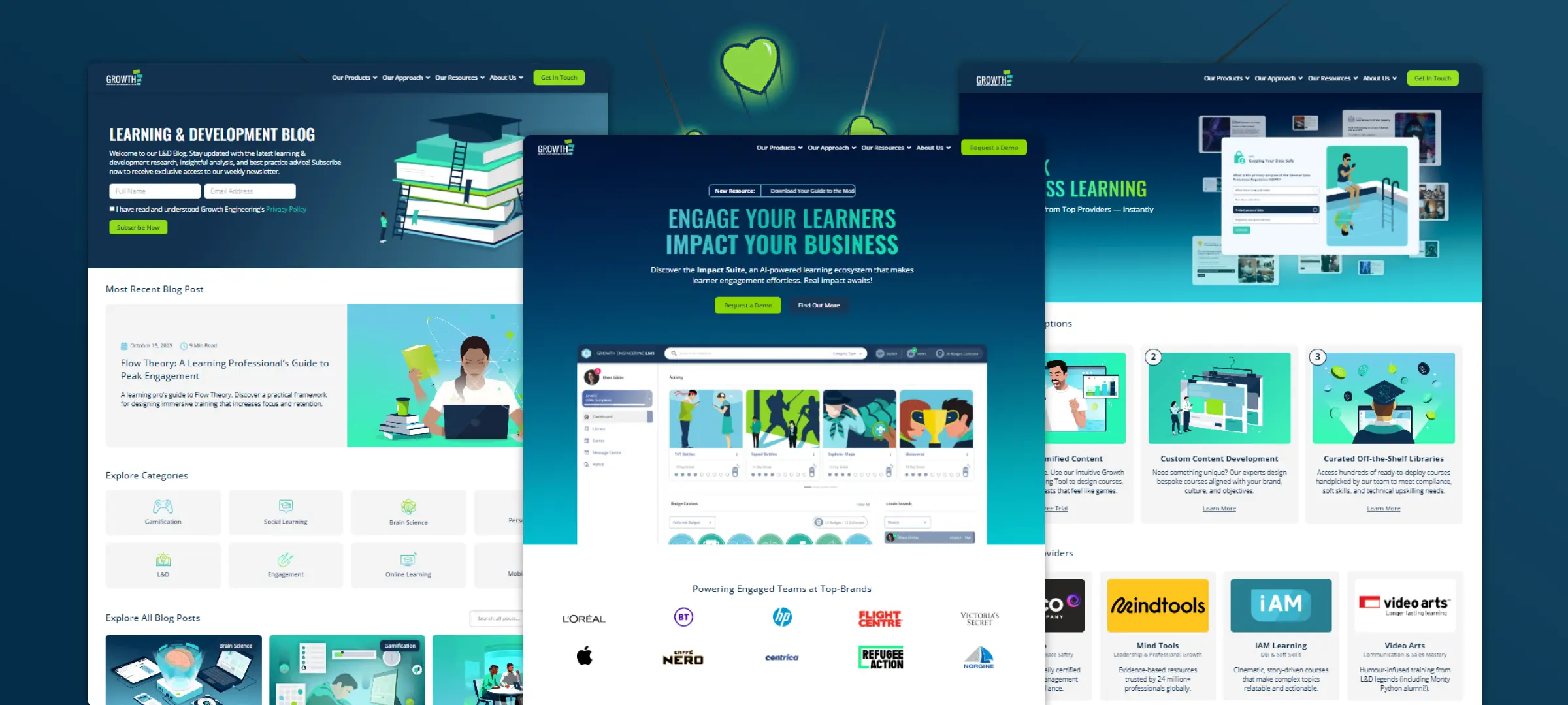
"The products have so many features, but it's not easy to see... The homepage is busy and im unclear where to go next."
Product Manager
“Updating content is a headache; I’m never sure if changes will break something.”
Head of Marketing

Design Process

The design process was iterative and collaborative. I’d prototype, then refine through feedback with the team, polishing each detail until change felt right.

🔎 Phase 1: Discovery & Priorities

  • Conducted a full review of the site’s usability, analytics, and heatmaps.
  • Researched competitor sites and e-learning industry trends.

💡 Phase 2: Ideation & Layout

  • Created wireframes and layout concepts in Adobe XD.
  • Iterated on designs based on stakeholder feedback.

🖌️ Phase 3: Visual Design & Prototyping

  • Built the website using WordPress & Elementor Pro for flexibility.
  • Improved caching and server-side optimisations for faster loading speeds.
  • Enhanced mobile responsiveness for seamless multi-device experiences.

🔧 Phase 4: Implementation & QA

  • Ran A/B tests to refine the homepage, product pages, and CTAs.
  • Improved the blog layout to boost readability and content engagement.
  • Kept up with modern web standards to ensure long-term performance.

Key Features & Highlights

🔍 Improved Blog Layout & Content Page

A powerful new feature that let users instantly locate learning content, social posts, and challenges. It wasn’t requested — but we knew it would solve multiple usability complaints. And it did.

🏠 Better navigation IA

A cleaner, more intuitive dashboard that put key info front and centre: progress, streaks, team leaderboards, and social posts.

🏠 Refreshed Homepage & Pages

A cleaner, more intuitive dashboard that put key info front and centre: progress, streaks, team leaderboards, and social posts.

🏠 Design System / aligned with company rebrand

A cleaner, more intuitive dashboard that put key info front and centre: progress, streaks, team leaderboards, and social posts.

🏠 Performance Boost / server optimisations and caching

A cleaner, more intuitive dashboard that put key info front and centre: progress, streaks, team leaderboards, and social posts.

🏠 Enhanced Security / HTTP to HTTPS

A cleaner, more intuitive dashboard that put key info front and centre: progress, streaks, team leaderboards, and social posts.

Constraints & Tradeoffs

This project was was across a nearly 7 year period. With lessons learnt along the way.

Plugin Conflicts:

We didn’t have extensive user analytics at the time, so decisions were made based on qualitative feedback and internal testing.

Limited Product Mockups:

Some gamification data (like dynamic streak graphs) couldn’t be displayed exactly how we envisioned, so we found simpler workarounds.

Quick Turnaround:

We moved quickly – but with more user feedback, we could have made even sharper decisions.

Outcomes & Impact

Although exact metrics were light, we saw promising early indicators:

+300%

organic traffic (post-launch SEO work)

+60%

demo sign-ups relative to baseline (first 3 months)

3x

improvement in site speed

"The redesigned website was widely praised internally and externally, with positive feedback from team members and customers. Today, it serves as a high-converting, user-friendly, and scalable platform that effectively showcases Growth Engineering’s expertise in gamified learning."

What I Learned

One of my biggest takeaways: Modernising an app isn’t just about design - it’s about familiarity.

We couldn’t throw away what users already knew, so every change had to feel both fresh and comfortable. That’s why the onboarding mattered so much. And why visual improvements had to support UX, not just aesthetics.

If I Did It Again...

With more time and data, I’d love to go deeper on behavioural insights – tracking drop-offs, validating new feature usage, and testing improvements across user types. There’s always another layer to peel back.

Tools & Deliverables

Tools

Adobe CC, WordPress, Adobe XD, Elementor Pro, GA4, Semrush

Deliverables

Interactive UI, Product Mockups, onboarding & CRO flows, dev-ready assets, Digital Design.