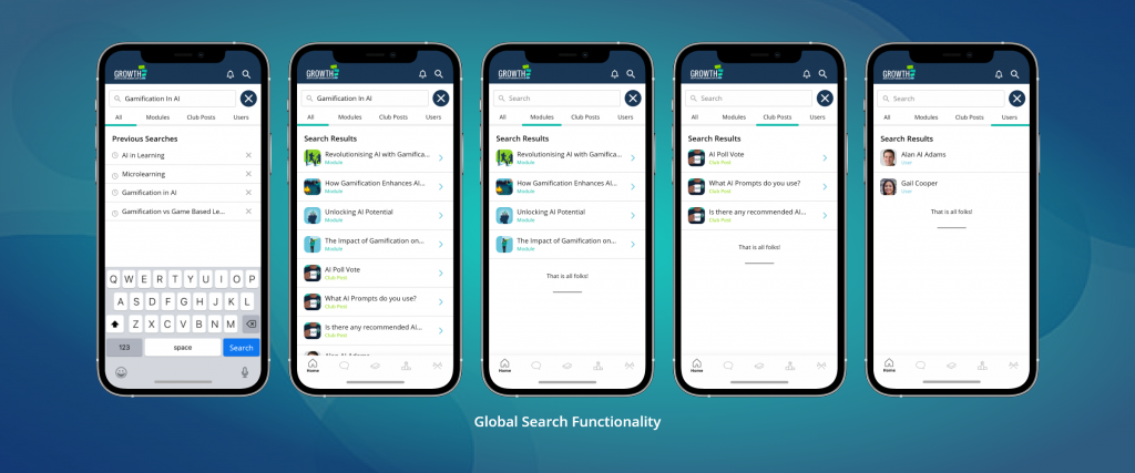
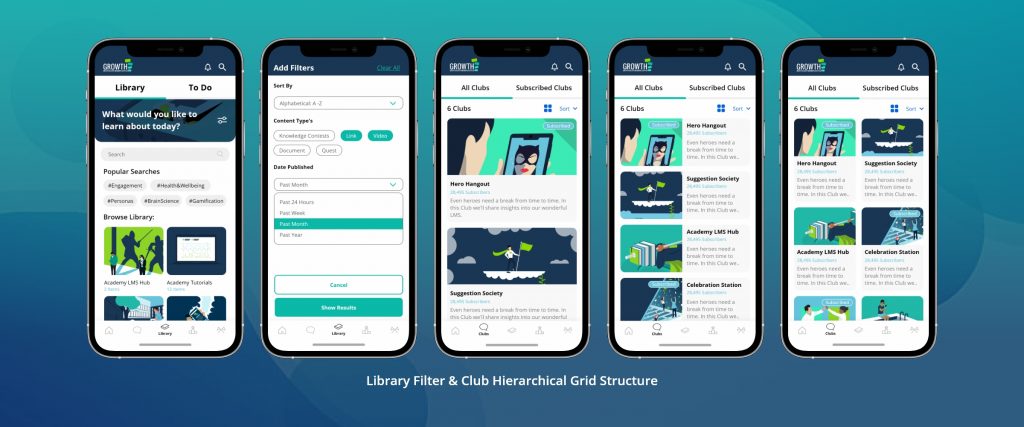
Case Study

Driving engagement and retention through a modern UI refresh
Project Overview
Role
Timeline
Responsibilities
Collaborators
The Learning App is Growth Engineering’s mobile solution – a pocket-sized companion to their LMS that enables gamified learning on the go. Designed for bite-sized content, it blends learning with social and game mechanics to boost engagement and collaboration between colleagues.
But despite its potential, the app wasn’t hitting the mark. Users struggled to find content, the UI felt outdated, and support tickets around usability were stacking up.
This wasn’t a project with a formal timeline or a shiny product launch – it was something more honest. A designer (me) seeing clear friction and saying, “We can do better.” So I did.
Outcome:
A UI/UX overhaul that improved navigation, user satisfaction, and sparked a noticeable rise in login streaks, task completions, and time on app.

My Role & Team
As the only designer on this project, I led everything from early pain point mapping to final UI delivery and dev support. I worked closely with our product manager to shape the vision, and partnered with our mobile developer to ensure the build matched the intent, down to the last pixel.
Responsibilities:
UX improvements based on internal and client feedback
UI refresh aligned with modern design principles and brand
Feature design and rollout support (e.g. global search, onboarding)
Dev handoff, reviews, and implementation QA
The Problem
Users couldn’t find what they needed - and it was costing us.
The app had real strengths: social features, gamification, mobile-first convenience. But users were getting lost. Navigation felt clunky. Pages were visually noisy. Even our own teams found it frustrating to use. From PMs to stakeholders to testers, the message was clear: people wanted to use the app – they just needed it to work with them, not against them.
We had a clear opportunity: modernise the app UI, reduce friction, and make learning feel intuitive again.


Discovery & Research
This wasn’t a research-heavy sprint with workshops and surveys – it was lean and scrappy by design. I dug into:
- Pain points flagged in support tickets
- Feedback from PMs, stakeholders, and testers
- App reviews and client messages
- First-hand walkthroughs of the current app flow
The standout insight? Content discovery was the number one issue. Users didn’t know where to go or how to find the next learning item, challenge, or leaderboard. That insight directly led to one of our biggest feature wins.

Defining the UX Strategy
1.
2.
3.
4.
Design Process
This was an iterative design journey – part lean UX, part continuous improvement loop. No big bang. Just thoughtful fixes and a consistent polish.
🔭 Phase 1: Scoping & Prioritisation
- Mapped UX issues to real user pain points
- Aligned with the PM on priorities
- Focused on high-impact, low-complexity wins
💡 Phase 2: Ideation & Sketching
- Mapped out improved journeys using light journey maps
- Proposed new feature ideas (like global search)
- Explored layout improvements and content hierarchy
📱 Phase 3: Prototyping
- Used Adobe XD to create screen-by-screen updates
- Refreshed visual style using consistent spacing, colour, and hierarchy
- Built clickable prototypes for walkthroughs
🔄 Phase 4: Dev Handoff & Support
- Worked directly with the developer for clean implementation
- Reviewed builds regularly to catch issues early
- Adjusted designs based on platform constraints

Key Features & Highlights
🔍 Global Search Functionality

🏠 Dashboard Redesign

👤 User Profiles & Onboarding
Added a lightweight walkthrough on first login to help users understand how to use the updated app – from search to social to tracking their progress.

🎨 Modern UI Refresh

Constraints & Tradeoffs
Data limitations:
Legacy tech constraints:
Tight feedback loop:
Outcomes & Impact
Although exact metrics were light, we saw promising early indicators:
+35%
+22%
4x
3x
"The new app feels so much easier to use - it just flows now"
Matt Thompkins - Product Manager @ Growth Engineering
What I Learned
One of my biggest takeaways: Modernising an app isn’t just about design - it’s about familiarity.
If I Did It Again...
