Project Brief:
The Blowin’ Smoke BBQ Logo Design project aimed to create a memorable logo for a startup Food and Beverage business specializing in crafting exceptional British BBQ rubs with an American-inspired twist. Our primary objective was to establish a brand identity that seamlessly blended British and American styles while maintaining a strong visual appeal.
Project Description:
For the Blowin’ Smoke BBQ logo design, our approach was a fusion of the brand’s values, mission, and target audience. We sought to craft a logo that would resonate with food enthusiasts, particularly BBQ and meat lovers, while conveying a sense of American flair and British sophistication.
Project Journey:
The logo design process was structured into four phases. In Phase 1, we conducted research on industry brands, evaluating their strengths and weaknesses. Subsequently, we initiated the creative process by sketching initial ideas regarding layout and style, followed by a comprehensive review and refinement of these concepts. Transitioning to Phase 2, we elevated the design quality by creating refined versions of the initial sketches. This phase included the development of two variations of the chosen concept, each offering distinct aesthetics. We actively sought feedback and comments to ensure alignment with our objectives. In Phase 3, we honed in on further refinement, focusing on one design from the initial three, and continued to collect valuable feedback. Lastly, in Phase 4, we fine-tuned the logo design, incorporating feedback received throughout the process. This resulted in the creation of high-quality versions suitable for various print and digital applications.
Key Features:
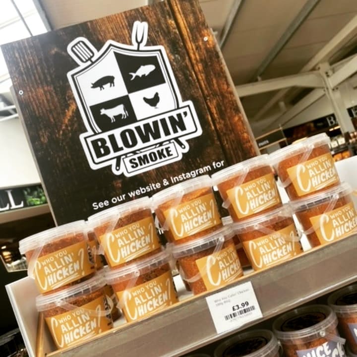
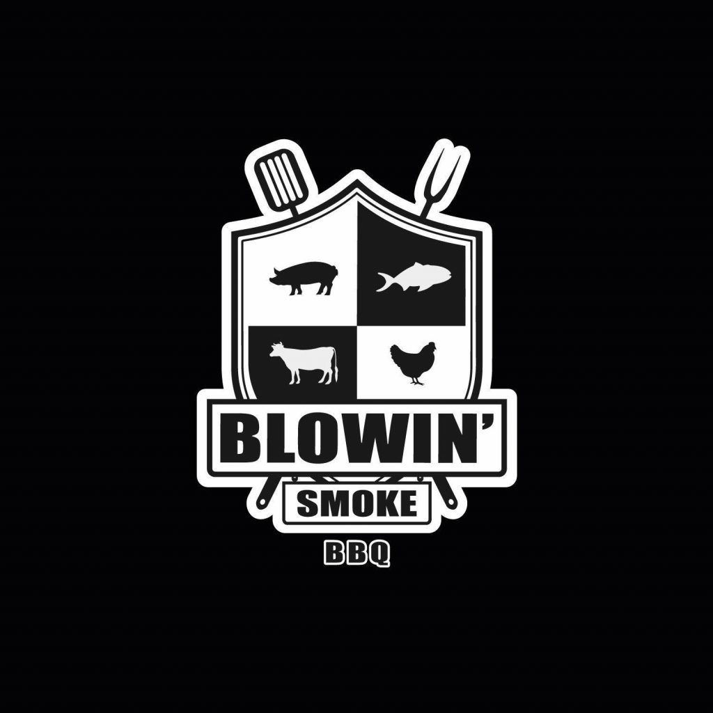
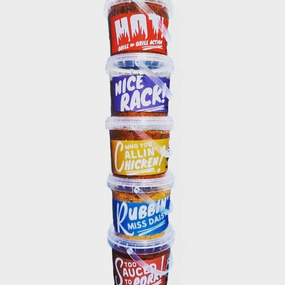
The shield logo, with a minimalist shield emblem intertwined with the brand name and BBQ-themed icons, symbolizes American-influenced food products. Additionally, bold typography was chosen for easy recognition and style that resonates with the BBQ industry. Animal iconography was also incorporated into the logo to engage with the BBQ meat food industry, representing popular meat varieties.
Challenges & Solutions:
Our main challenge was to create a modern logo with an American twist without resembling existing brands in the market. After in-depth brand research and design exploration, we identified common issues with similar brands: a lack of product differentiation, especially in meat types, and the absence of design elements that made logos stand out. Some American brands used bold outlines for visibility.
I began with preliminary designs, experimenting with shapes, animal outlines, and typography. I then shared the initial concepts with the client for feedback, allowing me to narrow down the preferred design choice. Initially, we explored a typographic approach with BBQ-themed icons integrated into the text. Another concept was a badge design with an American football logo essence but infused with BBQ elements.
Project Results:
The Blowin’ Smoke BBQ logo effectively captured the brand’s essence and values. Within three months of implementation, the brand experienced a 25% growth in social media engagement on Facebook and Instagram. Customers and the client’s friends praised the logo for its aesthetics and enticing product representation. The product was even added to the shelves in Longacres!
As the sole graphic designer for this project, I handled the entire design process, from concept development to final execution.