Introduction:
Welcome to the world of web design, where creativity meets structure in the form of grid layouts. Whether you’re a seasoned designer or just getting started, understanding the basics of grid layouts can be a game-changer for your digital design endeavors. In this article, we’ll break down the essentials of grid layouts, provide simple yet effective examples, and guide you on how to leverage this powerful tool to create visually appealing and functional web designs.
The Power of Grid Layouts:
At its core, a grid layout is like a blueprint for your web page. It divides your canvas into a series of columns and rows, giving your content a sense of organization and alignment. This structured approach not only enhances the visual appeal of your website but also improves the overall user experience.
Example: Imagine you’re designing a recipe blog. You can use a grid layout to neatly arrange recipe cards in columns, ensuring that each card displays an image, a title, and a brief description. This arrangement makes it easy for visitors to scan through different recipes and choose the one that appeals to them.
Responsive Design Made Easy:
One of the coolest things about grid layouts is their adaptability. In today’s world, where users browse websites on various devices, having a responsive design is crucial. Grid layouts automatically adjust the placement of elements based on screen size, ensuring a seamless experience across smartphones, tablets, and desktops.
Example: Let’s say you’re creating a portfolio for your photography work. With a grid layout, you can showcase your photos in rows on larger screens. As the screen size gets smaller, the grid adjusts, transforming into a single column for mobile devices, making it easy for viewers to swipe through your captivating snapshots.
Directing User Attention:
Grid layouts help you guide users’ attention to what matters most. By strategically placing content within the grid, you can create a visual hierarchy that leads visitors through your web page in a meaningful way.
Example: Think about designing an online clothing store. You can use a grid to present featured products in a larger column at the top. Below, smaller columns can showcase individual products with images, descriptions, and prices. This arrangement naturally draws visitors’ eyes to the top items while offering a clear path to explore more.
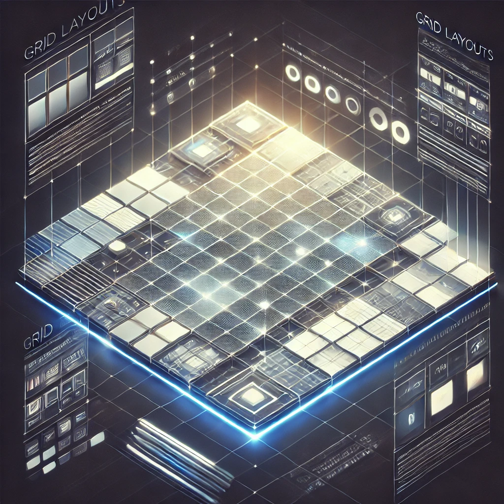
Insert Image or Diagram: [Insert Image/Diagram Here: Show a basic grid layout with labeled columns and rows, illustrating the concept of division and organization.]
Unleash Your Creativity:
While grids provide structure, they don’t stifle your creative flair. In fact, they enhance it. You can experiment with different arrangements within the grid, making your design both visually captivating and well-organized.
Example: Consider a personal blog where you share travel stories. Each blog post can have its own unique layout within the grid. Some posts might feature larger images spanning multiple columns, while others could focus on text, creating a dynamic and engaging reading experience.
Tools and Tips to Get Started:
Implementing grid layouts is easier than you might think, thanks to various tools and resources available. CSS frameworks like Bulma or Tailwind CSS offer pre-built grid systems that you can integrate into your designs effortlessly.
Example: If you’re designing a landing page for a startup, using a CSS framework like Bulma allows you to create a sleek and modern grid layout without diving into complex coding. You can align elements, create responsive designs, and maintain a consistent look, all with minimal effort.
Conclusion:
Grid layouts are the secret sauce behind many captivating and user-friendly websites. By embracing this fundamental concept, you’ll be able to strike the perfect balance between creativity and organization. Whether you’re showcasing your portfolio, selling products, or sharing stories, mastering grid layouts empowers you to create designs that captivate and engage your audience.


