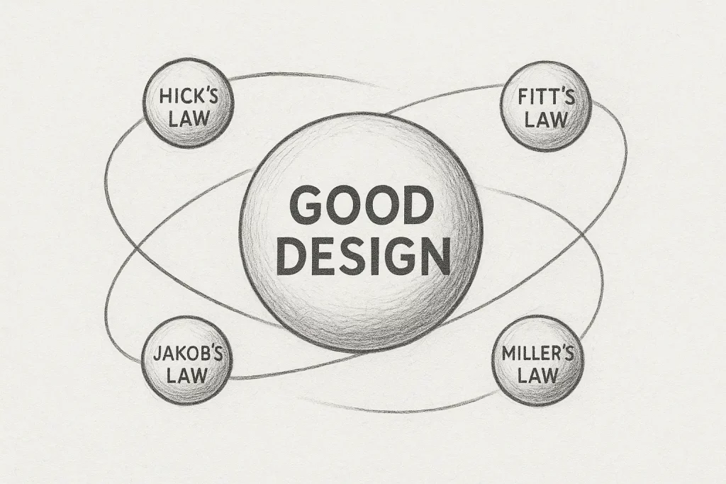
When I design – whether it’s an onboarding flow, a campaign site, or a product feature – I always come back to the same foundations. The laws of UX.
They’re not just theory to me; they’re a compass that keeps design decisions grounded in how people actually think and behave. I’ve seen over and over again that when projects lose sight of these fundamentals, even the best visuals or smartest ideas can fall apart.
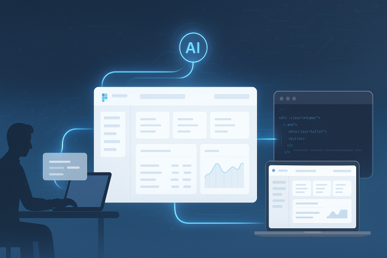
In a world that’s increasingly shaped by automation, AI, and data-driven tools, these laws remain constant. They represent the human side of design – and that’s something no technology will ever replace.
Hick’s Law: The Power of Simplicity
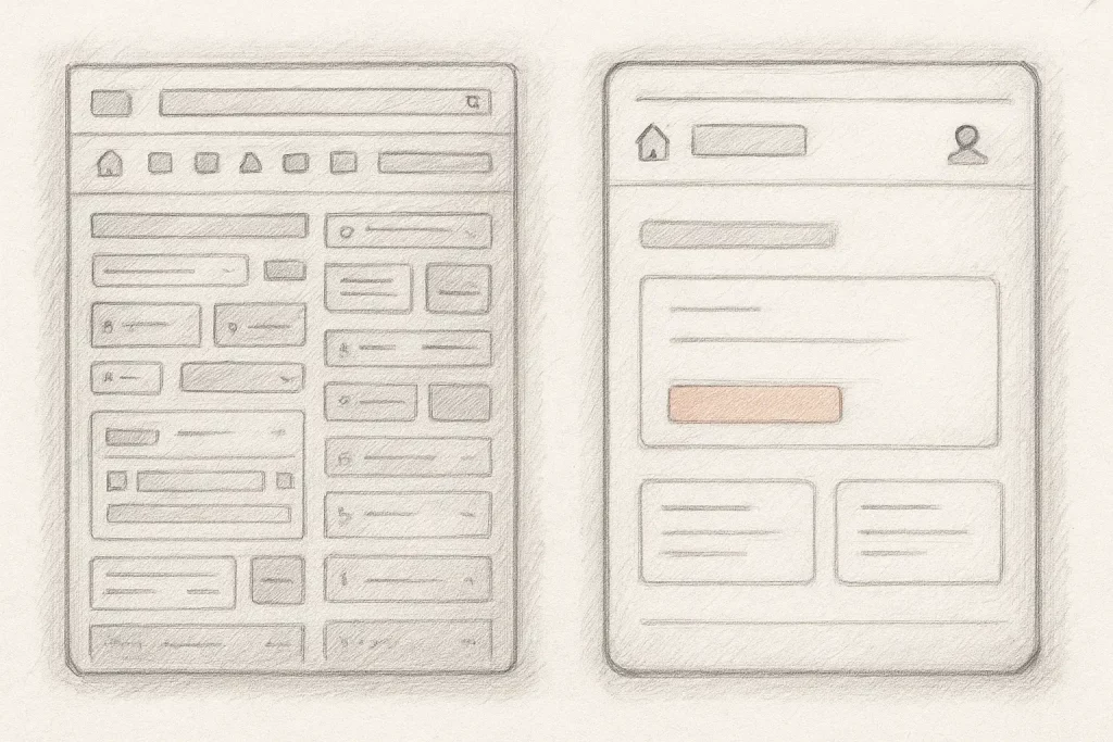
Hick’s Law states that the more choices a user has, the longer it takes to make a decision. It’s simple, but it explains so many everyday frustrations – overwhelming menus, cluttered dashboards, or forms that ask for too much upfront.
Every designer has faced that moment of wanting to add “just one more” thing. But each addition increases cognitive load. Hick’s Law reminds us to be intentional – to simplify the path, not complicate it.
In my own work, I try to think in terms of decision moments rather than decision points. What does the user need right now to move forward confidently? Everything else can wait.
Fitts’s Law: Designing for Movement
Fitts’s Law tells us that the closer and larger a clickable area is, the faster it can be accessed. It sounds technical, but in practice, it’s about making actions effortless.
Whether it’s placing key buttons within easy reach on mobile or giving enough visual weight to primary CTAs on desktop, this law turns usability from a theory into a physical reality.
Design isn’t just about what people see – it’s about how they move. And that movement should feel natural, not forced.
Jakob’s Law: Familiarity Builds Trust
Jakob’s Law says users spend most of their time on other websites, so they expect yours to work the same way. It’s one of those principles that quietly explains why some designs just “feel right.”
There’s a temptation to reinvent everything, especially when trying to make something stand out. But the truth is, familiarity builds trust. When users already know how something works, they feel at home.
As designers, our creativity should live around the pattern, not instead of it. The innovation lies in subtlety, improving the experience without losing the user’s sense of orientation.
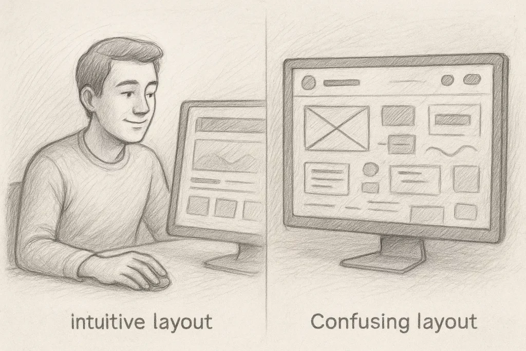
The Law of Proximity and Visual Grouping
The Law of Proximity reminds us that spacing isn’t just aesthetic, it’s communicative. When elements that belong together look like they belong together, users don’t need to think about how to interpret them.
Good spacing gives structure to information, clarity to hierarchy, and calm to complexity. It’s one of those invisible skills that makes a design feel intuitive before a user even realises why.
Miller’s Law: Respecting Cognitive Limits
Miller’s Law suggests that most people can only hold around seven items in short-term memory. That might sound like a limitation, but really, it’s guidance for clarity.
When designing something dense – like a dashboard, learning app, or multi-step form, I always try to reduce the mental load. Breaking information into digestible chunks, showing progress indicators, or using clear visual cues all help users stay in control.
If people can’t process what’s in front of them, they’ll disengage. Miller’s Law keeps us honest about how much information is too much.

Why These Laws Still Matter
These principles have been around for decades, yet they’re just as relevant today. They don’t rely on trends or tech stacks, they rely on how people think, see, and decide.
AI might soon generate entire interfaces or predict design patterns, but it still can’t feel the human experience. The laws of UX keep us connected to that empathy – they remind us that design is about people, not pixels or prompts.
When we understand these laws deeply, we can also break them purposefully. That’s where design matures – not by following rules blindly, but by knowing when to challenge them.
Bringing It All Together
Whenever I’m deep in a design sprint or working through feedback, I find myself coming back to these fundamentals. They help me simplify, clarify, and build experiences that feel effortless to use.
Because at its core, good design is about understanding people. Tools and trends will change, but the way we process information, make choices, and find comfort in clarity will not.
And that’s what keeps design timeless.