Case Study
Reducing Friction and Building Trust in Web3 UX
Problem & Context
Role
Timeline
Responsibilities
Collaborators
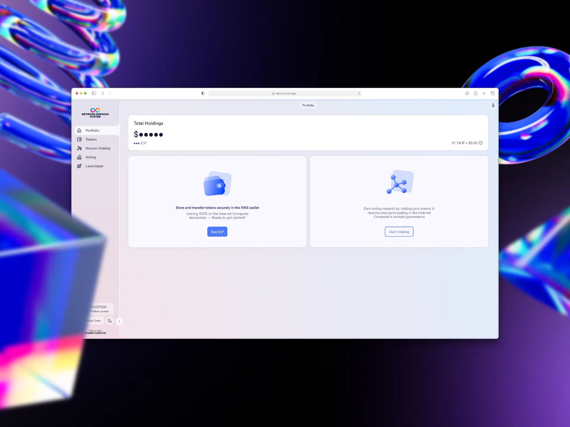
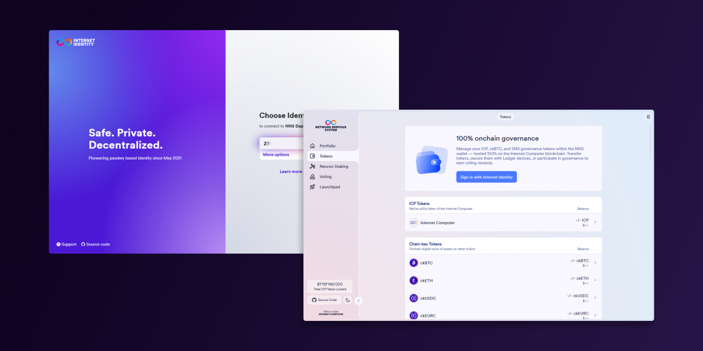
The NNS dApp is the gateway to the Internet Computer blockchain; a platform for staking, governance, and managing digital assets. But despite its powerful features, the interface often confused users. Interactions lacked polish and pain points surfaced regularly in community forums.
I joined the project on a short contract, working through a backlog of UX friction and design system improvements – from usability wins to new features. My mission: reduce friction, boost discoverability, and help make Web3 feel just as trustworthy and intuitive as Web2.
Outcome:
Delivering consistent, scalable UI improvements. Shipping new UX features like Balance Privacy, Governance Voting Overview and a Wallet Address Book. Reducing backlog, improving design system clarity, and helping to strengthen collaboration between design and devs.
My Role & Responsibilities
I joined the NNS dApp team as a UI/UX & HMI Designer, working full-time on a 4-month contract. While DFINITY is based in Zurich, I worked remotely from the UK – collaborating closely with a Product Manager, a team of 6 frontend and backend developers, and a Lead UI/UX Designer, who acted as my senior on the project.
Our setup was small but focused. We held weekly Zoom syncs and regular catch-ups across time zones to unblock progress quickly. Despite the distance, our pace was fast and iterative. There was a clear sense of trust and momentum, which gave me the space to take ownership of features and find quick UX wins across the app.
UI/UX & HMI Design
User Flows & Prototyping
Interaction Design
Maintaining the Figma-based design system
Outcomes & Impact
A more intuitive, accessible and scalable dApp, with smoother UX and new user-friendly features
40+
20+
2x
Features Shipped
25+
By the end of the contract, we had launched new, high-impact features like Balance Privacy, improved overall UI clarity, and created a more polished, consistent design across the platform. Alongside the visible changes, I also introduced Figma-side improvements, like better token handling and scalable components, that sped up design and dev collaboration.
We saw a noticeable reduction in backlog tickets, and my peers and the NNS community responded positively to the work. The Balance Privacy feature even made it into community-made YouTube videos highlighting helpful NNS features, a small but rewarding sign that users were noticing and valuing the addition.
The Wallet Address Book feature design is complete but is still in development, but I’m especially excited to see its impact once it launches. I expect it to streamline one of the more trust-sensitive parts of the Web3 experience – sending tokens to the right address without fear of address poisoning or copy-paste errors.
The Problem & Opportunity
A powerful dApp with missing pieces - and a community ready to grow with it
When I joined the NNS team, there was a backlog of features, ranging from quality-of-life tweaks to long-awaited core functionalities. Much of the UI was inconsistent or outdated, and the design system was only partially built out, making it harder to move quickly or maintain visual cohesion.
There were also accessibility gaps, missing patterns, and interaction quirks that chipped away at user confidence, especially for newer users unfamiliar with blockchain governance. Beyond the visual layer, users simply needed more: more control, more transparency, more intuitive flows.
Feature requests were coming from multiple fronts. Community members contributed actively on DFINITY’s forums, pushing for improvements and posting ideas. Meanwhile, internal priorities from the PM and leadership team helped shape a clear roadmap – the problem wasn’t lack of direction, but a need for focused design execution to bring it all to life.
The timing was right. The product had matured enough to support deeper improvements, and the community was engaged. Success meant shipping useful, intuitive features fast, then circling back to refine and polish. It also meant building toward a more scalable design foundation, so future improvements would come faster and feel more consistent.
Discovery & Research
Before diving into design, I spent the first couple of weeks getting under the hood of the NNS, not just how it worked, but how it was being used in the real world.
That meant hands-on walkthroughs of the platform, identifying friction points, and reviewing the backlog of community and internal feature requests. Most of these came through DFINITY’s forum, as well as Jira tickets and feedback from the PM and UX Lead. There was no shortage of ideas – the challenge was in understanding what mattered most and where design could unlock real user value.
While the team had some user personas and flows, they weren’t deeply detailed. So we often needed to identify user motivations and edge cases as we went, especially when tackling new features. This gave us the flexibility to adapt as we better understood how both advanced and everyday users interacted with governance tools.
When designing the new Address Book, we ran targeted competitor analysis on Web3 wallets like Coinbase Wallet, Phantom, Plug Wallet, and Binance. What stood out was that most tools offered some version of a saved address list, but it was either buried in menus or clunky to manage. I saw a clear opportunity to make it easier, more visible, and actually pleasant to use, especially for users who regularly interact with multiple wallets and accounts.
Prioritisation was collaborative. My UX lead helped shape our roadmap, and I’d often balance a larger feature in progress (like Address Book or Balance Privacy) alongside smaller design system updates or component improvements in Figma. This helped us deliver visible wins while keeping the design foundation evolving in parallel.

Defining the UX Strategy
Designing for trust, clarity, and everyday usability in a Web3 world
My UX strategy for the NNS dApp focused on removing friction, improving clarity, and building trust in a space where that’s often lacking. Web3 tools are notoriously intimidating, so our aim was to create intuitive, discoverable interactions that felt approachable to both crypto-native users and newcomers crossing over from Web2.
I approached prioritisation by balancing task size with impact on the community, leaning on forum requests, internal feedback, and leadership priorities to help us decide what to tackle next. It wasn’t just about building features, it was about building the right ones, in the right order. I followed core UX best practices throughout, with a particular focus on:
1.
2.
3.
4.
Key Features & Highlights
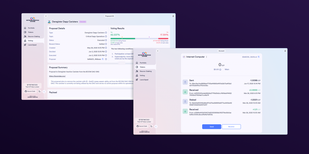
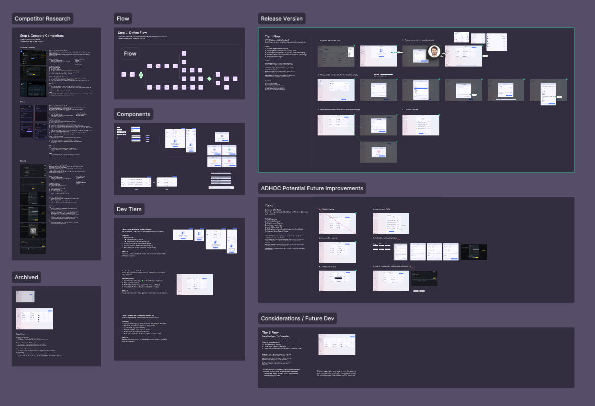
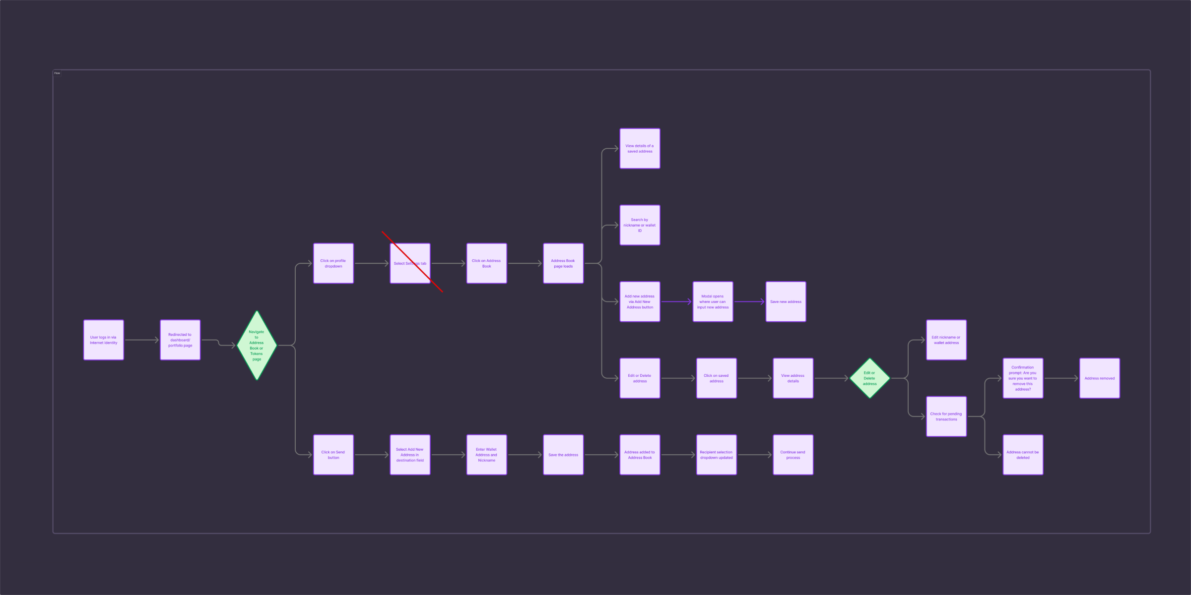
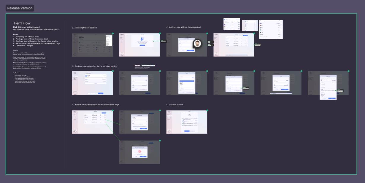
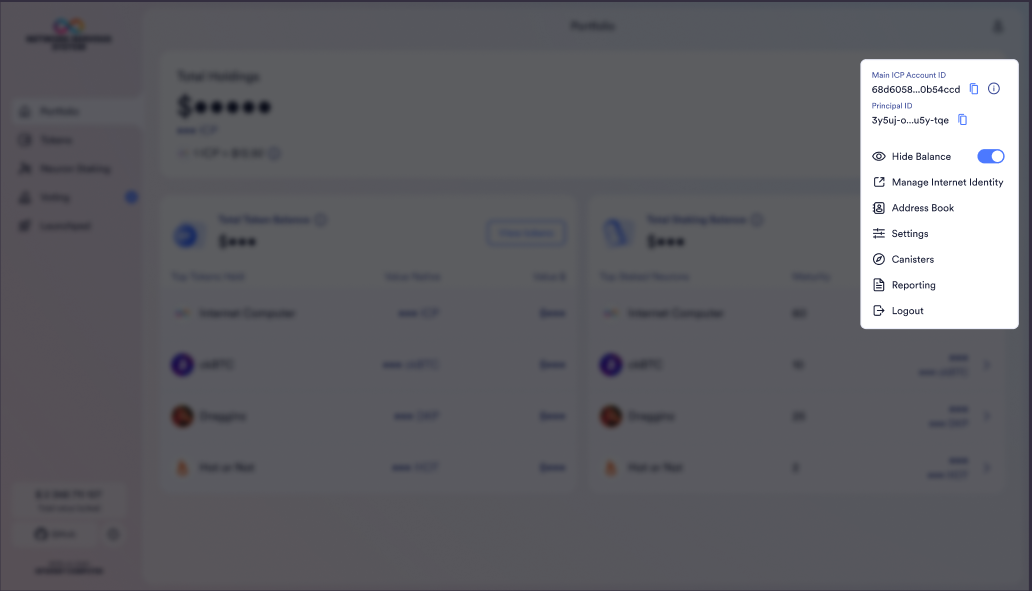
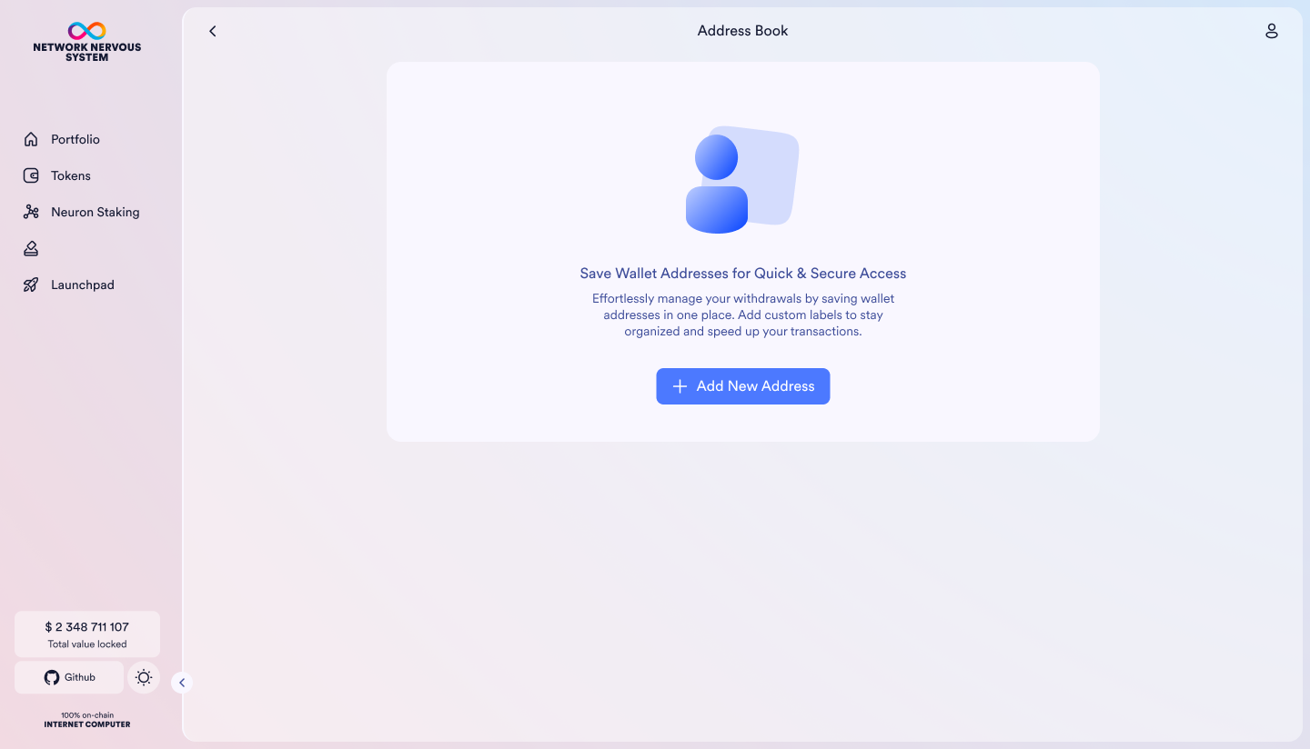
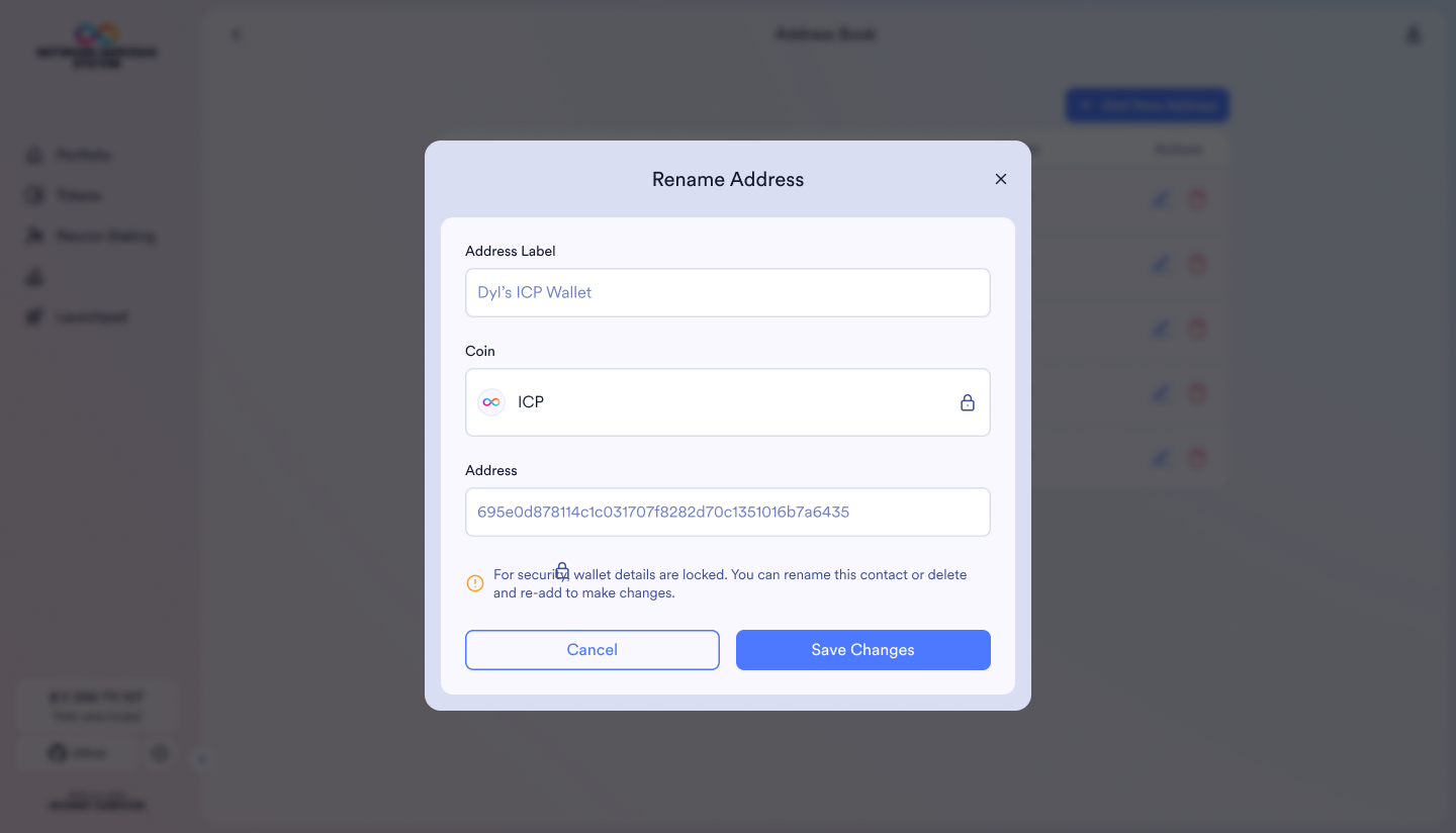
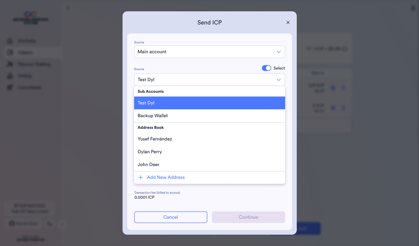
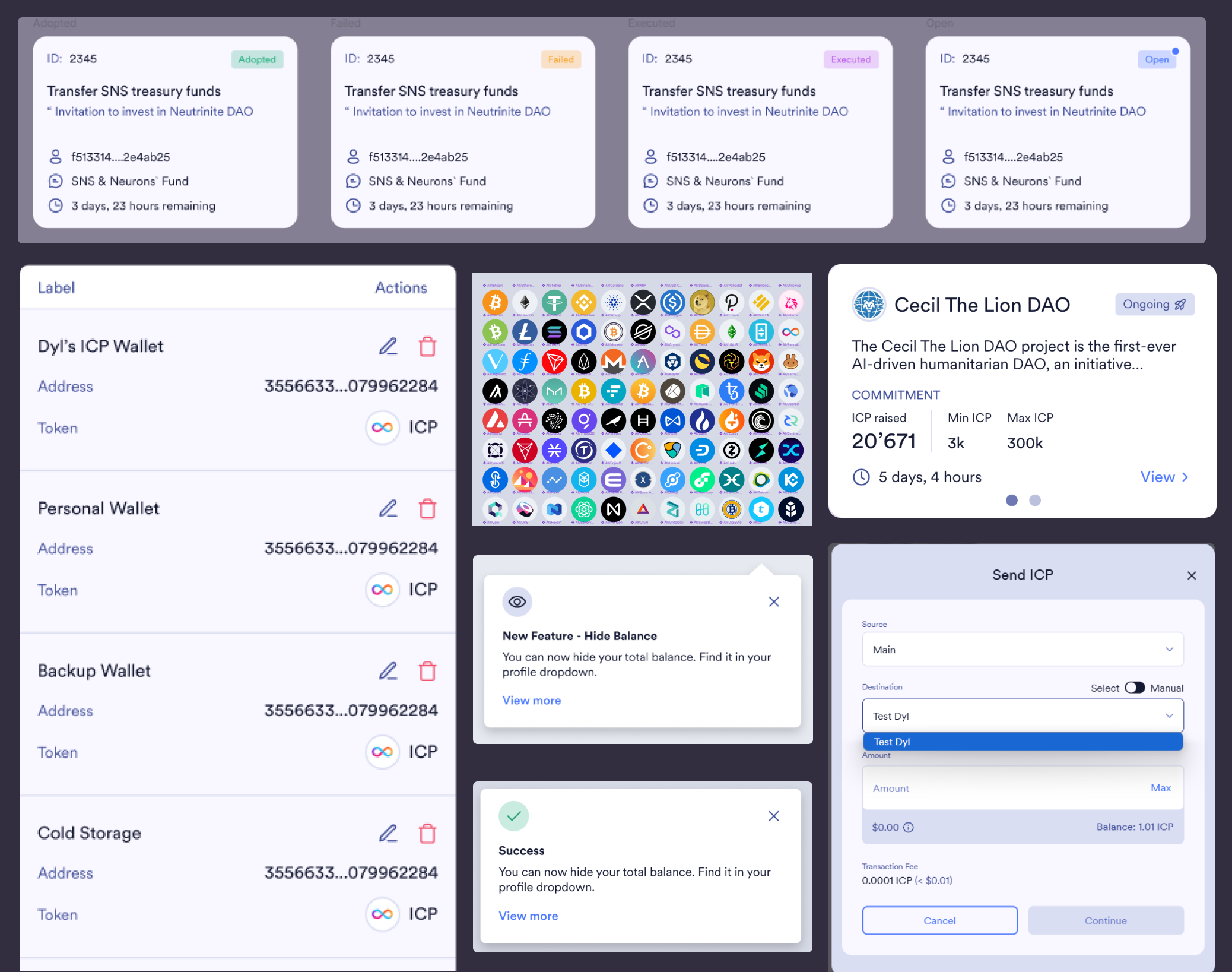
The Address Book
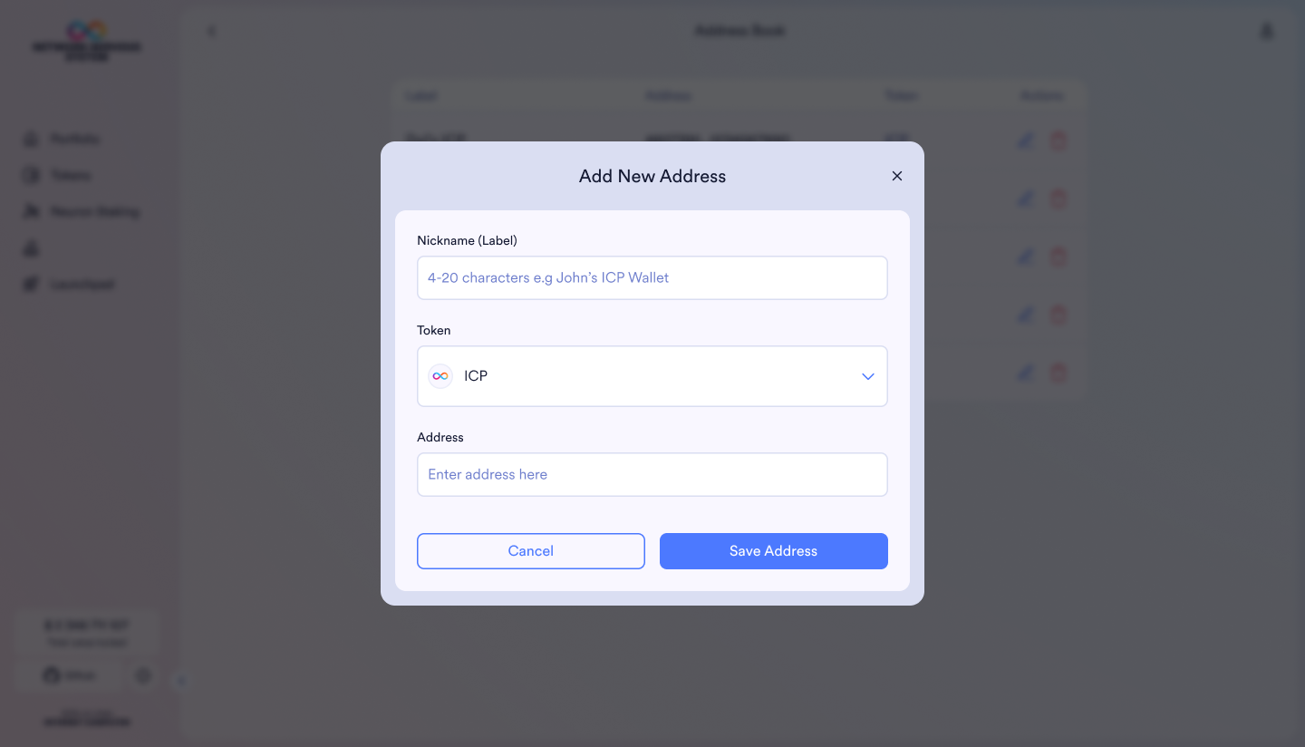
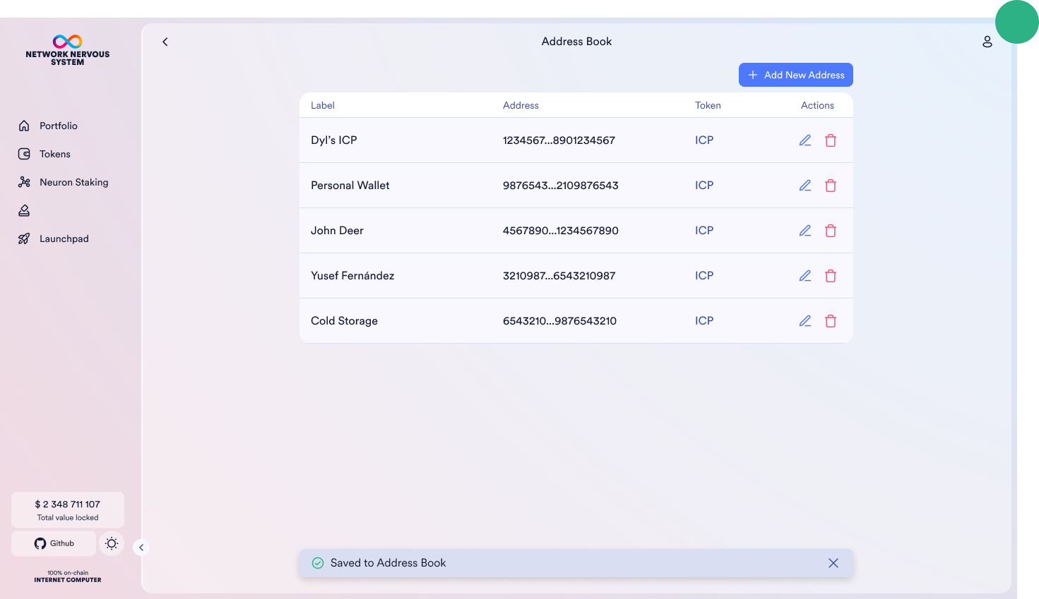
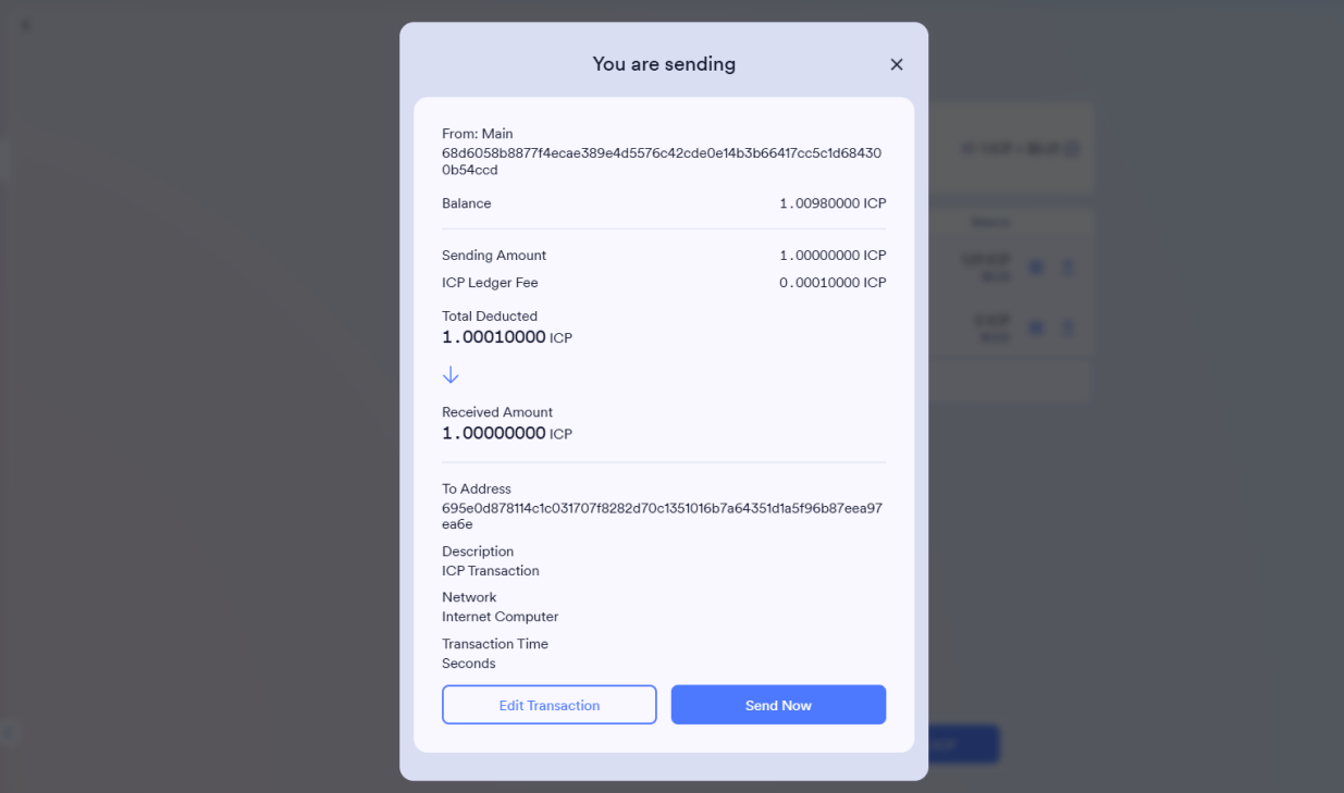
One of the most highly requested features was an Address Book – a central place where users could save, manage, and reuse frequently used crypto addresses. Without it, users had to manually enter long wallet addresses every time, which created friction, increased the chance of errors, and made the experience feel more technical than it needed to be.
I started by studying community feedback, walking through UX pain points, and mapping out user needs. We also analysed competitor platforms like Coinbase Wallet, Phantom, and Plug Wallet. What we found was striking: while most had some kind of address list, they were hidden behind menus, hard to edit, and not easily discoverable.
We saw an opportunity to improve on that, to create a Web3-native feature with Web2-level clarity. I designed the flow to make the Address Book easily accessible, with familiar patterns like search, edit, and tag functionality. It’s intuitive to update, quick to use, and fits smoothly into the dApp UI without creating visual clutter.
I also tackled edge cases around state management (e.g. empty state, duplicates, or deletions), and created responsive variants to ensure a seamless experience across screen sizes.
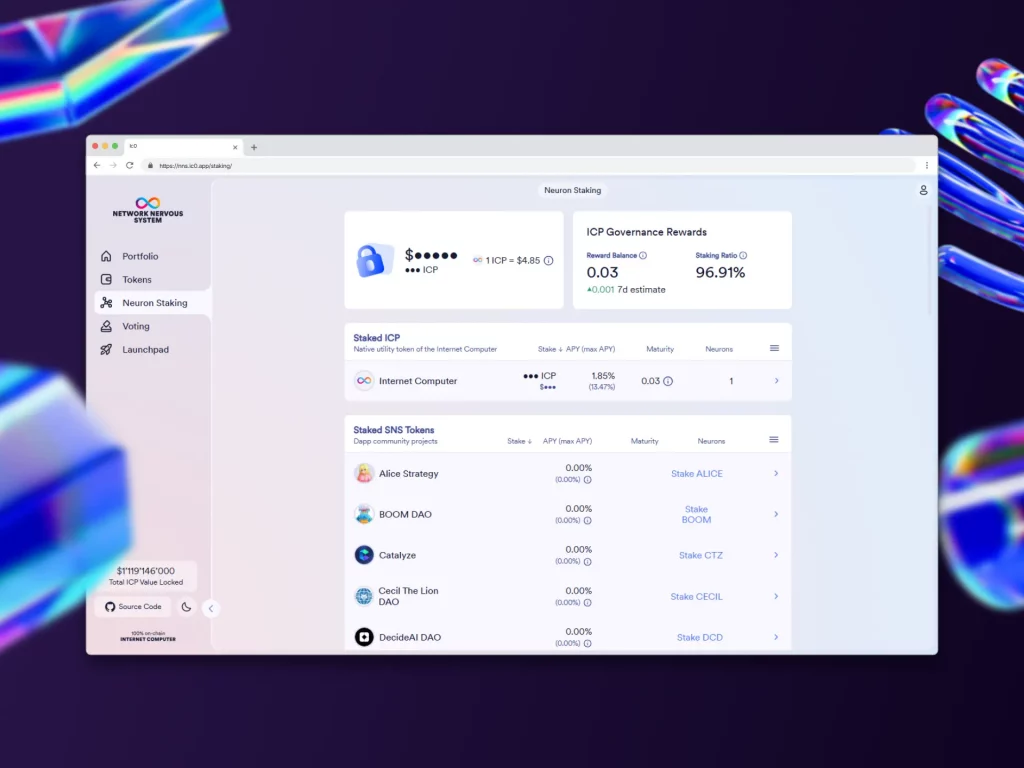
Governance Voting Overview
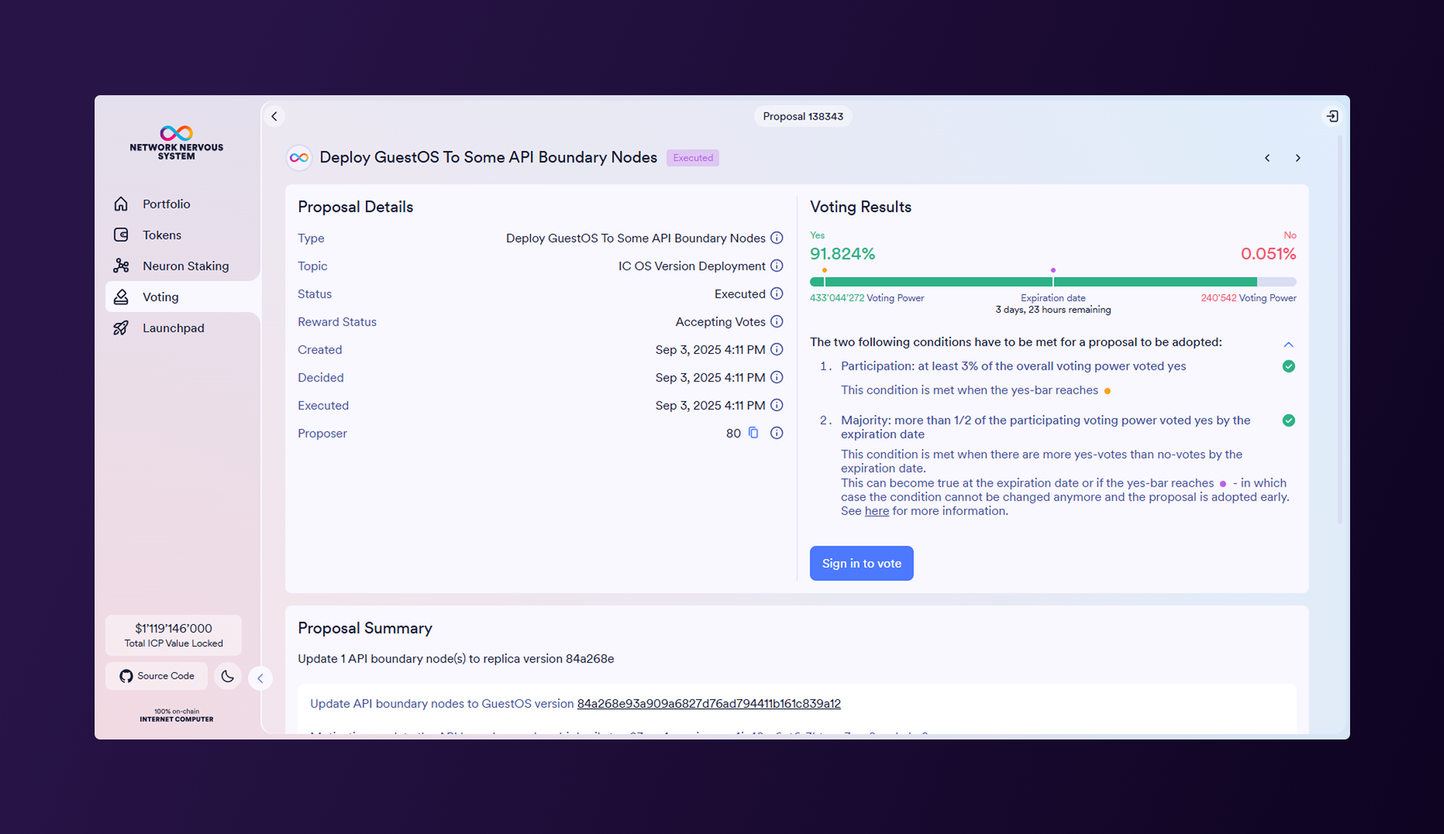
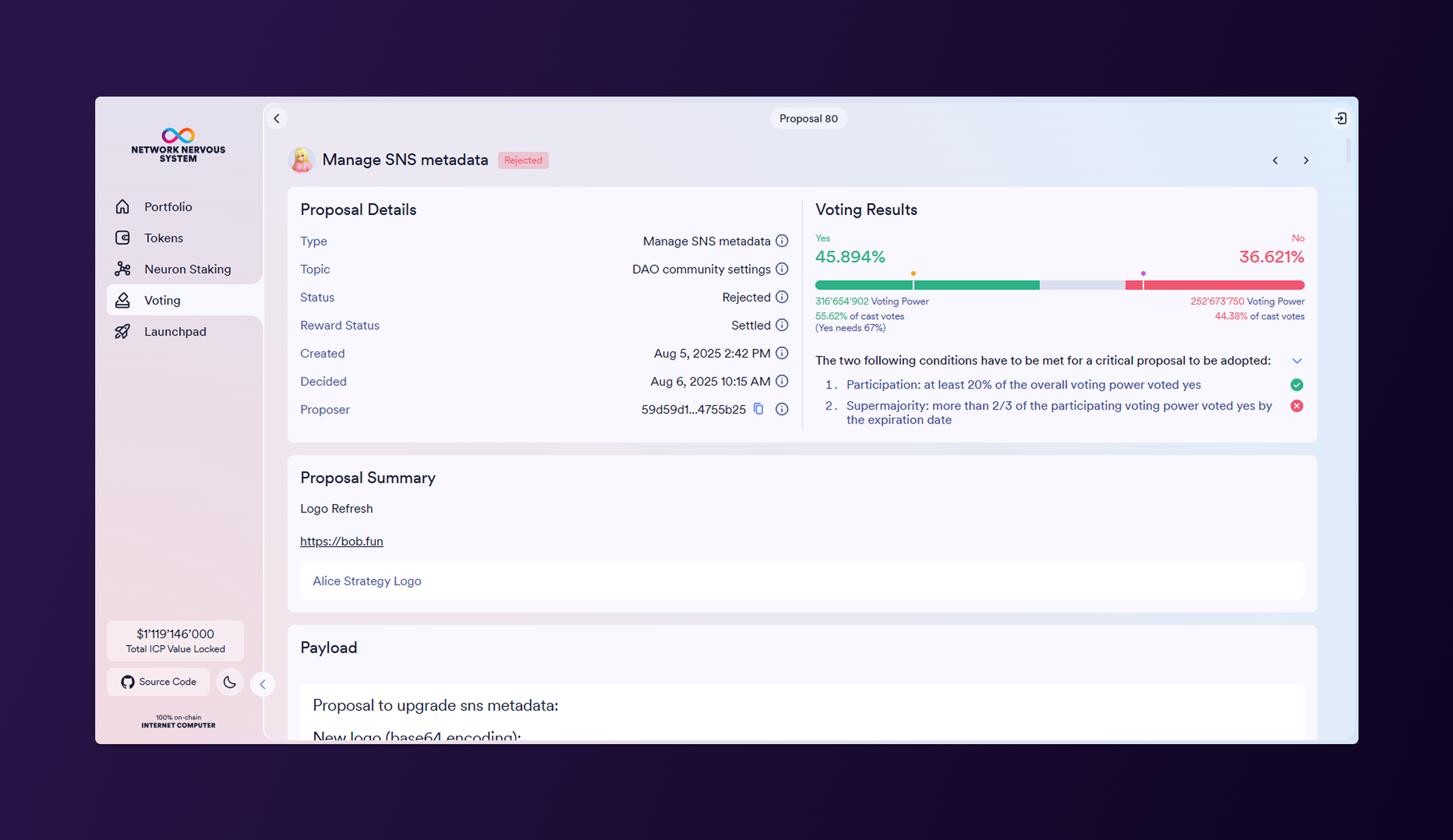
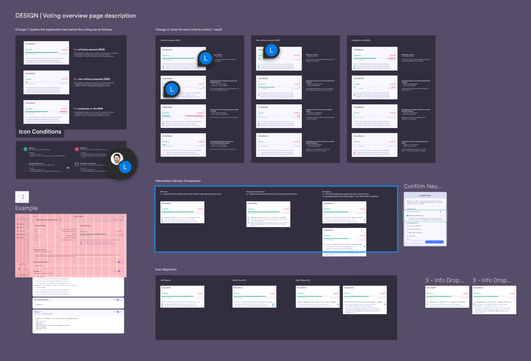
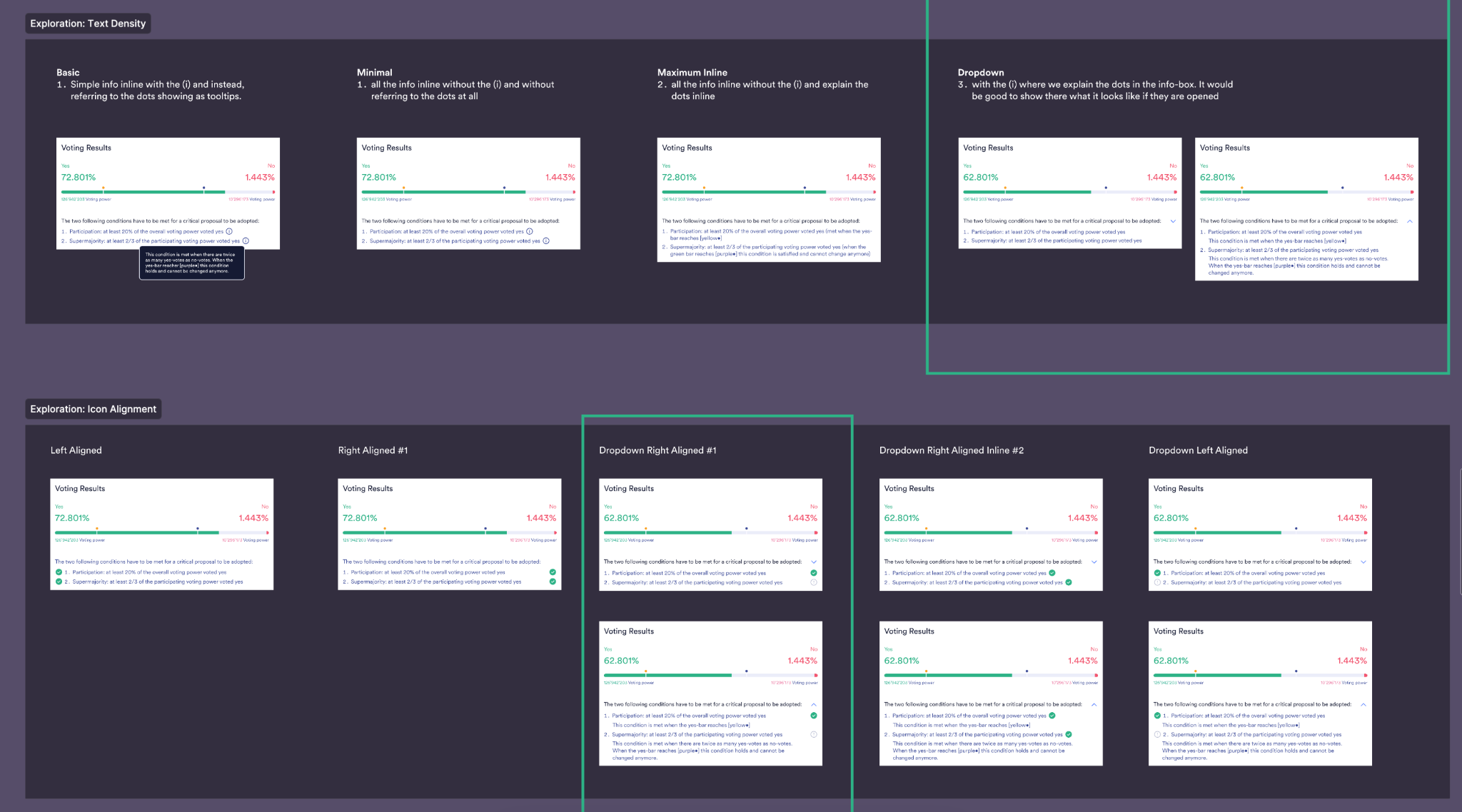
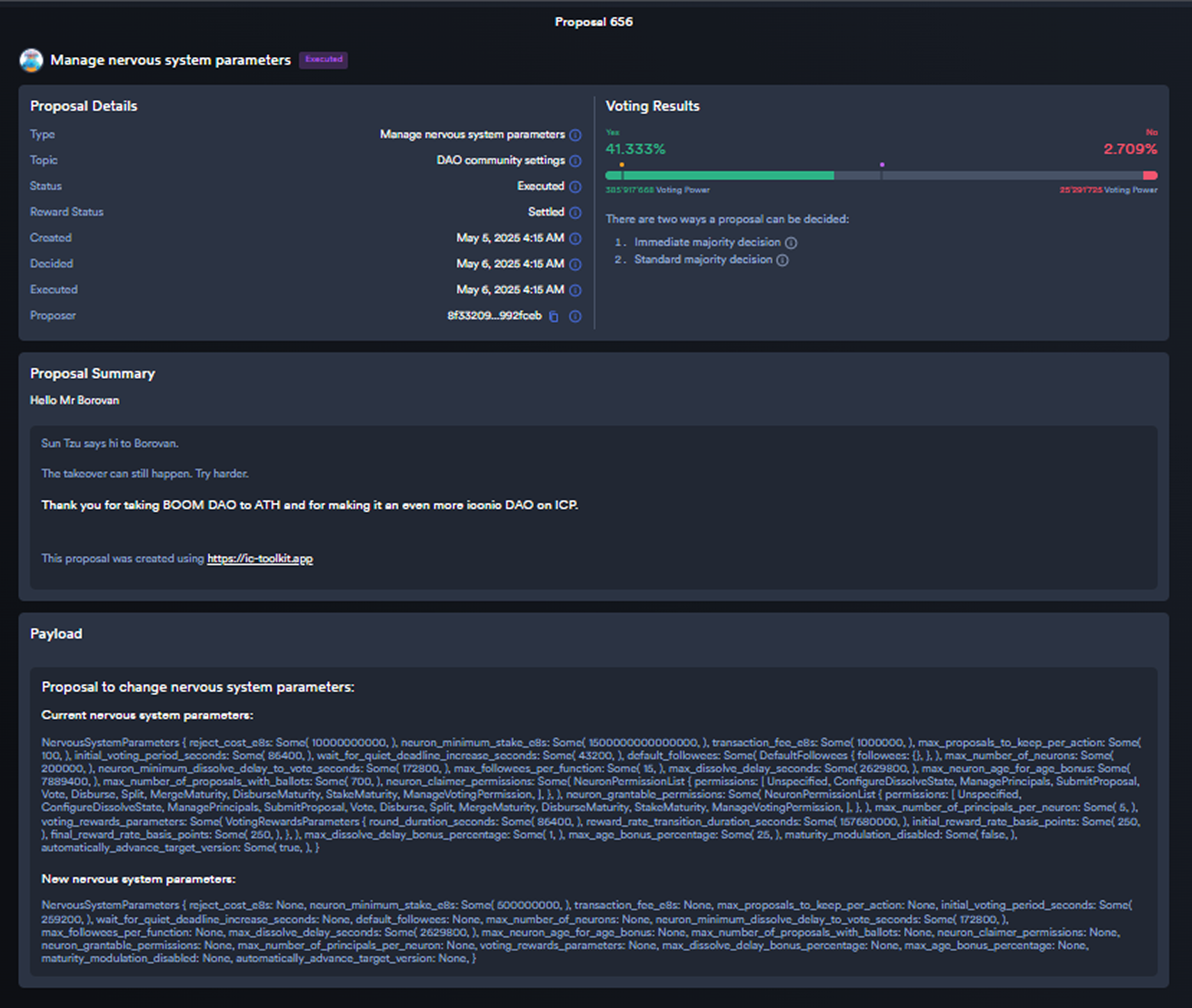
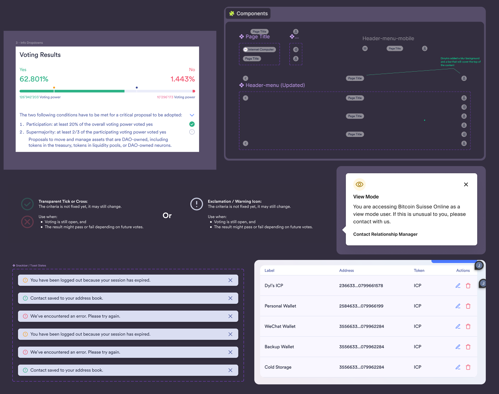
One of the trickier UX challenges on the NNS dapp was the Voting Overview page. The original design used coloured dots on the progress bar to indicate adoption thresholds, but these were often misinterpreted. In a critical proposal, for example, a user thought the proposal would pass once the green bar crossed the first dot, when in reality adoption required stricter criteria. This confusion was especially risky in close votes where clarity mattered the most.
To address this, I focused on improving both explanation and feedback. The voting criteria for critical and non-critical proposals were rewritten in plain, scannable language directly below the bar. Alongside this, I introduced a tick/cross system for each condition: transparent when still in play, solid when fixed. This gave users immediate insight into whether thresholds had been met – or if they could still change.
The result was a small but impactful improvement. By making the adoption logic visible and easy to follow, the design reduced misinterpretation and added trust during high-stakes decision-making. It also set the stage for future enhancements in the upcoming launchpad and community page redesigns.
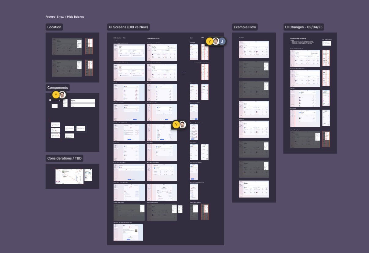
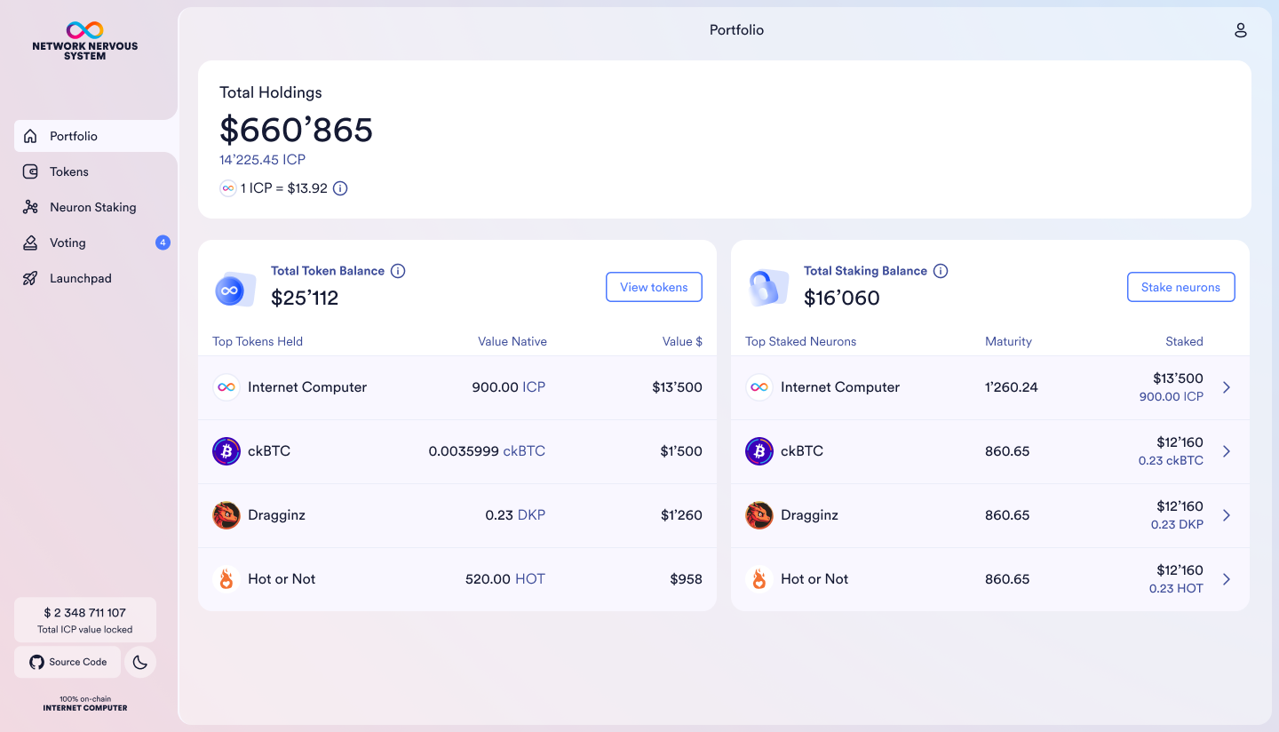
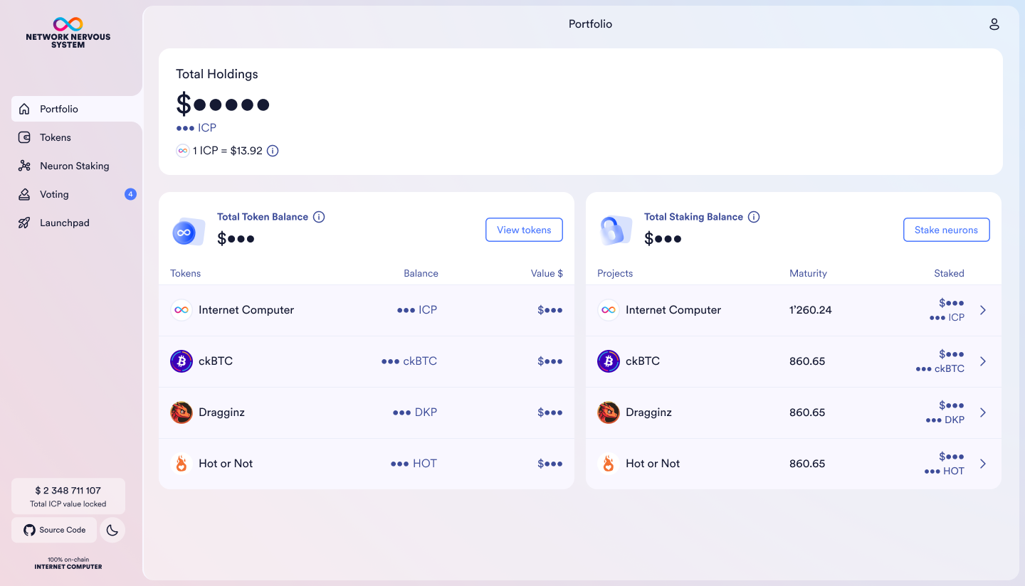
Balance Privacy Feature
Another win was the Balance Privacy feature, a subtle but powerful quality-of-life improvement. In Web3, users often share screens or access wallets in public settings. Being able to hide sensitive balance information globally across the app adds a sense of control and trust.
I kept the UI light and familiar: a simple eye icon placed in the top-level user dropdown, allowing users to toggle balance visibility from any page. I also created a flexible toggle component in the design system that could be reused for future privacy-related features. Variants were built to support both visible and hidden states across the entire UI.
The result is a feature that feels natural and unobtrusive, but deeply valuable to anyone concerned about privacy or screen-sharing. It’s the kind of interaction that disappears into the background, until you need it.

"The new privacy balance toggle is slick. Nice touch"
Community user via forum @ DFINITY
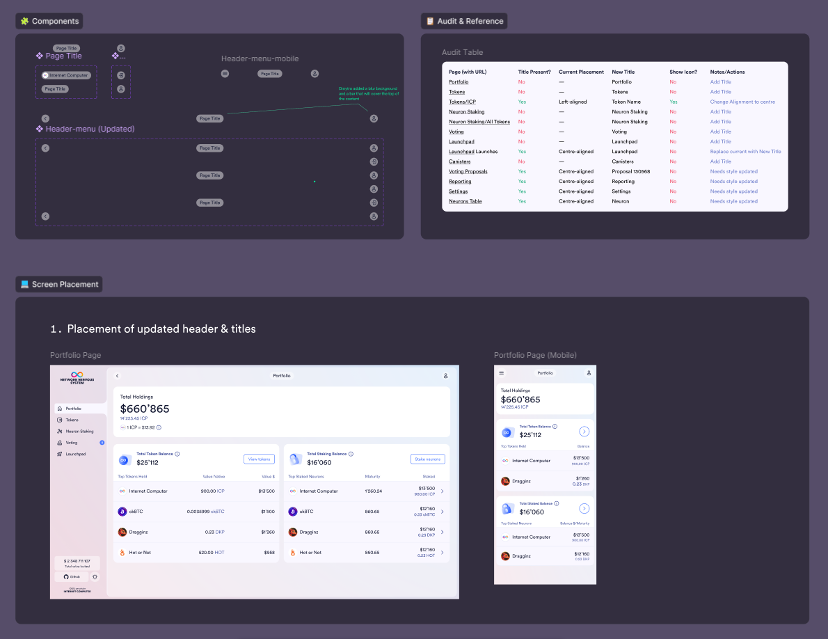
Design System Contributions
Alongside feature work, I made consistent improvements to the Figma-based design system. I introduced:
- A new toggle component with icon-swap flexibility
- Visual states and variants for hidden/visible balance handling
- A new announcements widget that allows the team to push dApp-wide updates or feature highlights to users
- Crypto Icon Design Token with Variables
- Improved Figma Naming Structure
- Copy PID Button Component States
- Warning States
- Page Title Component Redo
- Parameter Change UI
- Critical Proposal Visbility Improvements
- Highlight Component
- Dropdown Component Variants
- Design System Icons
These contributions not only improved scalability and speed for our current team, but helped lay the groundwork for better consistency going forward.
Constraints & Tradeoffs
Take the Show/Hide Balance feature
To avoid long debates over UI placement, I presented three viable design and placement options early on. This helped us move quickly into dev alignment and reduced back-and-forth. The final design fit naturally into the existing system and allowed global toggling with minimal disruption.
The Address Book had slightly more complexity
One feature I’d hoped to include was automatic wallet address verification during entry, but due to current limitations, it wasn’t possible at launch. Instead of blocking the rollout, I created two versions: one with verification (for future iteration), and one without – ensuring we could still release a valuable feature while keeping the door open to evolve it later.
We also intentionally designed the Address Book in three MVP tiers:
- A simple version for immediate community use and feedback
- A second tier with grouping and tagging
- A third tier with wallet verification and smart integrations
This approach meant we didn’t have to compromise on quality, we just built with scalability and user adoption in mind. Early community feedback could inform the next tiers without needing to rebuild the foundation.
What I Learned
A more intuitive, accessible and scalable dApp with smoother UX and new user-friendly features
Reflection & What I’d Do Next
This was one of those rare projects where everything just clicked – a smaller backlog, a thoughtful team, and space to deliver meaningful UX improvements. I’m proud of how intuitive and consistent the new features feel, and how they align with the broader design system.
If I had more time, I’d love to dive deeper into usage data, especially after the Address Book goes live. Observing real user behaviours and edge cases would help guide future iterations and uncover hidden friction points.
I’d also be curious to revisit certain UX patterns from a more mobile-first perspective, as some parts of the dApp are still primarily desktop-focused. There’s definitely opportunity to optimise for smaller screens and explore what a more simplified, mobile-native Web3 experience could look like.